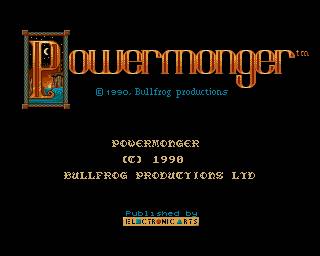
An Ambitious strategy game by the greatest hype man in gaming, Peter Molyneux
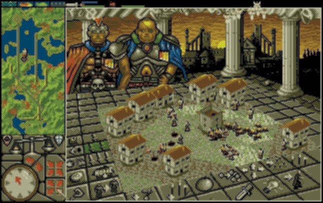
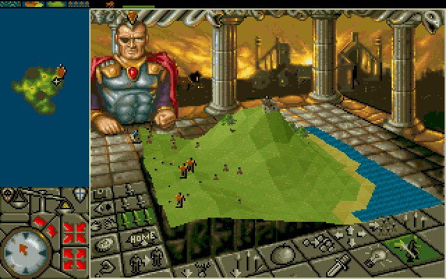
Developed by Bullfrog after having made the landmark Populous game. Powermonger is a real-time strategy game where the objective is to gain a majority control of the land. The game features a 3-D map just like Populous, though only the topography is in 3-D, the rest are sprites. It also features an advanced AI system (for its time) similar to Tropico that both make the game lively and interesting, but also frustrating.
Game Structure
You start the game with a few soldiers under your command, and a captain representing your avatar. You become the victor by capturing territory and literally, tipping the scales to be in your favor.
Gameplay
To conquer territory and grow your army, you must send captains to capture neighboring towns and turn them to your side. You always have the option of passively turning them, or slaughtering them for quicker dominance, however, you have less possible recruits to fill your army. You will also encounter the enemy’s army – battles being decided by numbers and equipment. Food is really important as a resource, as its used to keep people loyal, and also used to create equipment. There other resources like steel and wood which again are used for equipment.
Through equipment, you basically turn regular soldiers into what the equipment is , like swords, bows, or even catapults. You can gain new captains by conquering cities with neutral captains. These other captains are important because if your starting captain dies, you lose, so you will be delegating to the other captains to do more dangerous task. Another interesting aspect of the subordinate captains is that the farther they are, the longer the delay between the orders you give them, since a carrier pigeon must fly and give them the orders.
Conclusion
As true to the Molyneux style, this game is ambitious in its design. Every unit has their own jobs and status, like in Tropico or a more simplified Sims. A lot of what happens in the game does so without your input. Its a very interesting game, though for me, I was unable to grasps its mechanics easily. Its user interface is obtuse in its design. You must depend on a guide to be able to understand what each of the buttons do. Even though most of the screen is UI related, it still feels like there is missing information.
You also have to constantly use a query command to know the status of towns, troops, pretty much everything since it’s not displayed anywhere else. It needs a lot of re-design to make it more accessible for newcomers. In the end, I wasn’t able to play very much to form a more robust retrospective. But it still served as a view into a different kind of RTS – a more sim-like experience.


Sorry, comments are closed for this post.